
Friday, 29 April 2011
Friday 29th April
Thursday, 28 April 2011
Thursday 28th April
I decided before creating any of the other pages I would need to start planning the pages of my book so I have an idea of where I am going with it. However, first I needed to edit the story so it is not so long, and features the more sinister elements too. I then created a rough plan to place the text where I wanted on each of the different pages, I then created 3 sketches with different compositions for each of the pages featuring the text I had already planned, then selected the page which I would work best.
I then began to work again on the images that are almost exact copies, as I am working over the photocopies I have done of them. I started on the Snow White image.
 The dress looked a bit green as the inks merged together a bit more than they did in the original, but I thought it looked okay so started working on it further. However, I used a different type of tracing paper on the back to trap the ink, and over a few days I have realised it's not absorbent, therefore the inks are still wet and are running and mixing. I have decided I am going to re do this page using the original materials I did before so the dress will stay more as two seperate colours.
I then began to work again on the images that are almost exact copies, as I am working over the photocopies I have done of them. I started on the Snow White image.

Wednesday, 27 April 2011
Wednesday 27th April
Although I have only just began planning the pages for my final A3 book, there were two pages I was absolutely certain I wanted to feature in there, I had created smaller versions in my sketchbook but had decided they had worked so well that I did not want to change them in any way, these were the two pages of the evil queen in her disguise as an old woman (as shown below).
 I decided what I would do is use the photocopier to photocopy the image, but blow it up to the larger a3 size that I wanted. I photocopied them onto thick tracing paper which I have previously worked on, I decided to do this as I have been playing round with using paint on the reverse side of the tracing paper as it shows through and creates some interesting patterns, which I have used in the background above and in some other areas. I then started working into the A3 images, it has taken a lot longer than I thought it would, especially as half the work was done for me by photocopying my original drawings. I will have to remember this when working on my other pages, and try and begin to work quicker.
 Shown above is the two A3 pages I created which are going into my final book. They are very similar to the original smaller ones I created, however there are some changes to the colours and materials I used. I have stuck them to a larger piece of paper so they are ready to be constructed into the final book.


Tuesday, 26 April 2011
Tuesday 26th April

Today, I also took the Disney Snow White book I have been working from, and edited down the story so that it still makes sense, but it's not as long. I then wrote it down and added the extra details such as the Brother's Grimm, more sinister elements. I then went and numbered each bullet point and created page layouts of which text will fit together in which page. I may come back to change this at a later date, but for now I think it works well. I then started to roughly plan some compositions for each page in order to see what they will look like. I will create two or three sketches for each of the pages and then will decide on which works best.
Monday, 25 April 2011
Monday 25th April

Someone saw this image on a blogging website and thought of my work. I thought the image was really strong as it uses negative space in order to create the silhouette of Snow White. The image is taken from the forest scene when Snow White panics, the scene is quite sinister as the trees are scary and the music adds to the atmosphere. I wanted to try and take this idea and change it slightly, I wanted to use the Disney silhouette of Snow White, rather than the adapted version as shown above. I also wanted to use the animals from the Disney version.

I think my image has worked quite well, however the original image has more depth to it as some of the woodland animals overlap slightly, where as mine feels very two dimensional and flat. However I like the way I have worked on to white paper and then stuck it on to brown. Some text created on the typewriter may work well to accompany it.
Saturday, 23 April 2011
Saturday 23rd April

I used tracing paper to over lay two images of Snow white as a skeleton. I tried to create a large image of the face in the background which would be fainter, and allow the image in the foreground to stand out. However, the image in the background is covered, I wanted the skull to show through, however only the hair and bow is visible. I could develop this by the use of different media and materials in the foreground image, as once again the image has become quite flat. I'm still unsure whether I want to use this image in my final book or not.
Wednesday, 20 April 2011
Wednesday 20th April
I used today to go into London and visit the other exhibitions I did not get time to see when I last went. Firstly I visited the Saatchi gallery as I had gone on the website to look up the work of Paula Rego, and wanted to go and see this painting in real life as you can not get the whole experience just viewing it online. However, when I got to the gallery they informed me the painting was no longer at the gallery, it is just on their website. I took a quick look round the gallery but didn't spend too much time as I wanted to get on to the other places I had planned to visit which I knew would benefit my project.
Next I went to the St. Bride Library for printing, publishing and the graphic arts. I wanted to go to take a look at the books on typography and calligraphy. The library was a lot smaller than I had thought, however I did find one or two good books explaining some techniques. The first book is 'Lettercraft' by John R. Briggs and the second is 'The Encyclopedia of Calligrapgt Techniques' by Diana Hardy Wilson. I will go on to research these online or maybe even buy them in order to get a closer look. The library was useful but I thought maybe I'd get a bit more out of it, I was looking for some unusual font faces but they all seemed to be quite plain.
I then went on to Kensington Palace, to the Enchanted Palace exhibition. I have visited before and the exhibition is one of my personal favourites, they create such an eery atmosphere with beautiful props and costumes. I did a few sketches in my book which I will develop and incorporate into some experimental Snow White sketches.
Monday, 18 April 2011
Monday 18th April
Although I have kept up evaluations on this blog about each page I have created, I had not created any annotations in my sketchbook. Today I set out to do this, starting from the very first page I had created to the very last, as it was over 60 it did take a few hours! However from now on I am going to keep up to date with the annotations as I create each page.
I then began to sort out some pages I need printing out to file in my visual reference folder, I will continue this tomorrow.
I then began to sort out some pages I need printing out to file in my visual reference folder, I will continue this tomorrow.
Friday, 15 April 2011
Friday 15th April


I decided I needed to act on the advice given during my group crit the other week. I took the advice of having a two layered image, both featuring the same outline but one showing the 'perfect' Disney version of Snow White, and the other being a skeletal version, to show how sinister the themes are in terms of the poison apple. I think the idea is really good, and I like the way they feature exactly the same silhouette, however, I think as the whole a4 paper is pulled up to reveal another image, they become very detached. I think I could develop this if I cut the actual silhouette out, and you lifted this rather than the whole page up.

Taking the idea of Snow White being in this skeletal form after eating the poison apple, I adapted the famous 'kiss' scene to feature this too. I like the image but I used water colours, I don't think the subtle tones work within the image and when creating this again I will use acrylic paint of oil pastels in order to get stronger and more vibrant colours. I also combined some type using the mismatch stamps I have used before. I think this works well in framing the image.
Tuesday, 12 April 2011
Tuesday 12th April
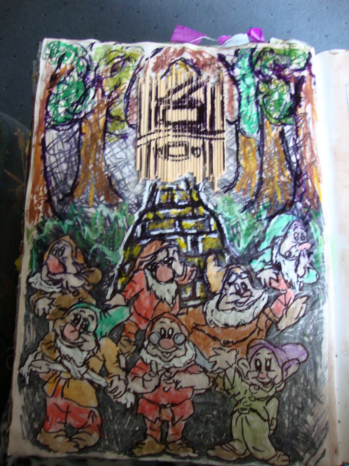
As I left a page blank previously after my other Seven Dwarf's page, I wanted to go back and do some more imagery on them. I created a scene in the woods with their cottage in the background. I think the composition works really well but I need to develop the image with different textured materials, as I started to do with the cottage made out of wooden sticks. I mixed water colours and oil pastels to get a mixture of subtle and more intense colours, however when I went to fix the oil pastels with hair spray it caused the black marker to run. I quite like the effect it created in the wood part of the page, but on the dwarfs it ruins the image as you can not see them as clearly. I need to come back to this composition and develop it at a later date.
Sunday, 10 April 2011
Sunday 10th April

Saturday, 9 April 2011
Saturday 9th April
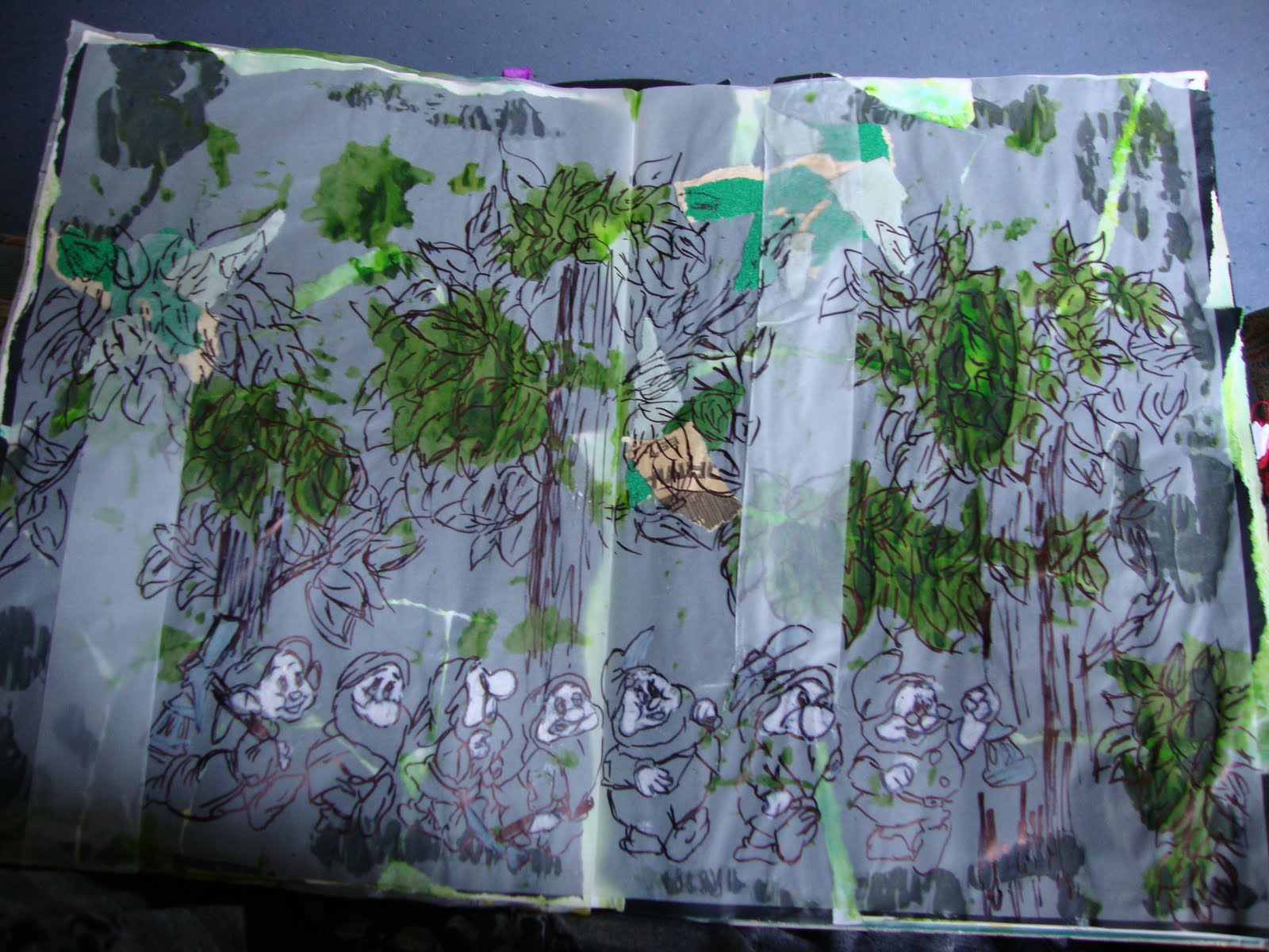
This page needs more development and maybe more materials in order to create the wood with all the trees. Other colours may be nice to bring in as it just seems very boring and plain. As I thought this when I was creating it i stopped focusing on finishing the dwarfs and just paid attention to the background info. I could maybe draw back on some materials I used in previous projects before christmas. For example, I sewed green netting into a scrunched up ball and used it as the greenery for the tree which worked really effectively. I think that might bring this page to live a bit more with some more texture and some different colours. I will develop this later, as well as looking at the seven dwarf characters.
Friday, 8 April 2011
Friday 8th April
I decided to watch the film I had planned on earlier, Brothers Grimm. I thought it would be useful as the story is based on the fairytale writers, and features a fictional tale as well as lots of elements from many of their stories. However, there were only a few references to the story of Snow White. The film contained the famous 'Mirror, mirror, on the wall, who's the fairest of them all?' as well as a quick shot of an old woman knocking on a door with a red apple, amongst some other small references. Although it did not relate a lot to the story of Snow White, or help me in terms of telling the original story, watching this film has proved quite useful to me. I took photographs of imagery that I think portrays a sinister feel, as well as a video I recorded that I think will be useful to my stop motion animation.
I have printed the photographs I took of the film and filed them in my visual reference folder, I am going to go on and use these images to inspire some pages in my development work. I will then come back to the video (shown below) when researching and making my animation to accompany my book.
I have printed the photographs I took of the film and filed them in my visual reference folder, I am going to go on and use these images to inspire some pages in my development work. I will then come back to the video (shown below) when researching and making my animation to accompany my book.
Thursday, 7 April 2011
Thursday 7th April

I feel this is one of the strongest pages in my book, and it just goes to show how working out of your comfort zone can pay off as I think the best work I have created so far are the experimental pages. I think it would work really well to use this particular page in my FMP as it really does make you feel the frantic panic Snow White is in.
Wednesday, 6 April 2011
Wednesday 6th April
Carrying on with experimenting using different materials, I took a page from my book which I had produced in a 'controlled' way, I took it and replicated it using different materials. It still needs some improvement but I think in this instance I prefer the original, which was created using fabrics. I think I will maybe go on to combine the fabric materials but in a less controlled way to come to a better compromise.
 However, I do think the background works effectively. As I had already identified it gives a good 'sinister' and dark feel I have used it more than once. I created it by squirting black paint onto the page in my sketchbook, I then press a sheet of tracing paper against it, this leaves some areas stuck to the paint and others not, which also gives a bit of a texture.

Tuesday, 5 April 2011
Tuesday 5th April
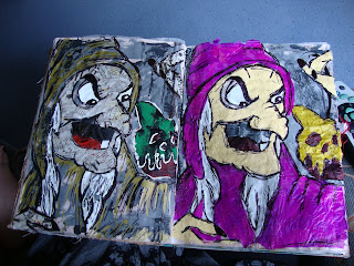
As already identified, I need to work on being less controlled in my work. I took today as my opportunity to do this. I selected a strong image of the wicked queen which I have already created in my book and decided to use this and develop it. I created two pages, one using more muted colours, and one using brighter colours. I created the muted colour one first as I thought it would work best in portraying the more sinister image, however once it was completed I felt it could be stronger. The mixed media, however, did work so I decided to continue with this element.

I then created the second image with the bolder colours, I think the strong colour of the purple is what makes this image so successful and I have selected this one to use in my FMP rather than the other, more controlled, images. I will work on developing some of the other more controlled images and try to use mixed media in order for them to become more exciting.
I then created the second image with the bolder colours, I think the strong colour of the purple is what makes this image so successful and I have selected this one to use in my FMP rather than the other, more controlled, images. I will work on developing some of the other more controlled images and try to use mixed media in order for them to become more exciting.
Monday 4th April
Today, the whole of my foundation course took part in a group crit, this allowed us to look at each others work to understand what they are doing, and give advice on how they could adapt or develop it further.
Peers looking at my work said the following:

Peers looking at my work said the following:
- I could use the element of pop up sections in order to censor certain parts of the story- having the truth underneath the pop up section that is revealed as the mechanism is in action.
- Another peer suggested I tried to look at work of a previous student she knew, who created an animation (which I will also do alongside my book). The previous student had created 3D and then animated them with the use of stop-motion.
- As I am playing with the light and dark side of the story, someone suggested I use contrast and colour in the pages themselves, e.g. the Disney story would be bright, happy colours, and the Brothers Grimm side darker shades and tones.
- Another student developed the pop up idea in terms of how the truth would be revealed- suggested that I should use tracing paper and have the nice illustration on top, then when lifted up there would be the same outline but with a more sinister illustration.
- The use of type could play on the nice and evil themes, I would have to explore the connotations of each type face and how they make the audience feel.
- Instead of having an animation, another peer suggested I could have the old fashioned style wheel rotating animations, maybe even hanging from the ceiling as some sort of installation.
- Someone then suggested instead of having the animation as a stop-motion animation, I could replace it with a flip book.
- I then identified myself as the other group members were asking me questions about my project that I need to look at ways of bookbinding and how I want my book to look.

Sunday 3rd April
I tried to create a page spread that might actually feature in my book. It featured the scene from the book where the Prince kisses Snow White to wake her up. I continued the theme that I think is working well in terms of the envelopes, and thinking about it, I would place the part of the original story where Snow White is sick and it dislodges the apple.


Subscribe to:
Comments (Atom)