-I discussed artists and other areas I could go on to look at with three peers in my class. We identified that as well as looking at artists that illustrated or created type layouts for books, it would be useful to look at actual book artists in terms of the construction and presentation process. My tutor suggested visiting a large book store in London would allow us to see a variety of themed books and let us compare them like for like, this would work better as it would be near enough impossible to do this by just looking at them online.
-Someone suggested I look at the 'Little White Lies' magazine that can be viewed online as the latest edition had a clever use of typography. The image above is a screen shot of the type and layout that I thought would be most effective in my own project. The overlaying of type creates a really strong image which I think could work quite well in the more sinister aspects of the story.
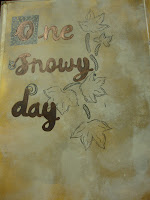
-I also began to play around with basic typography, however I aim to become more experimental in terms of materials and layouts. I also want to attempt to bring the style of the image above into my work


No comments:
Post a Comment