Thursday, 31 March 2011

Thursday 31st March


I decided to use the artist Hayley Potter to create my next page as I had stated in my SOI I think her style and techniques may be useful in creating a bold image.
I used the last image of the Prince carrying Snow White as they fall in love. I thought it would be the best image to link to the work of Hayley Potter as well as staying relevant to the story and not doing it for the sake of using the artist. I played on the minimalist feel and added some type created by my typewriter, which says 'Happily ever after' three times. I feel the composition works really well and the page is so simple that it creates a really strong image and gets the point across.
I added an envelop in the polkadot pattern I have previously worked with as I think it creates interest while still remaining simple. I think this is important to keep it simple so the two pages work well as a double spread. These are personally two of my favourite pages and I want to add to them to use in my FMP. The envelope also contains a letter which says 'The dwarfs forced the wicked queen to dance on hot iron shoes until she burnt to her death' as in the original story although Snow White and the Prince do live happily ever after, the queen dies a more gruesome death than is told.

Wednesday, 30 March 2011

Wednesday 30th March


I experimented with different types and colours of card in order to see which would stand out. I quite like the combination of the two different shades of green, especially as it is an ongoing colour and theme throughout the book. I also created a brown envelope and stitched in it, I think this adds really nice detail and I could develop the motifs to sew on to it. I could sew motifs that are connected to the theme of the secret that is inside the envelope.
I also did some illustrations of the woodland animals that feature in one of the Disney versions' scenes. However, if i do develop the use of these characters I need to work on the composition and placing of each.

Tuesday, 29 March 2011

Tuesday 29th March

Using a cut out technique I created this rose. I thought it could be used in combination with text or just as a decorative page. However I think the composition is not right and this page is not interesting. I think this could be improved with a stronger colour in the background to make the cut out technique stand out, but I don't think I will try and improve it as I don't want it in my final FMP book.
Experimenting with font faces and the positioning of text on the page.

Monday, 28 March 2011

Monday 28th March

Using the technique of overlaying imagery over text once again, this time I was playing around with having patterned red apples which creates a bit of interest. I've decided after I have finished experimenting with different ways of portraying the apple section of the story, I will ask my peers and tutor which ones they feel would work best in the A3 final book. If there are several that are working well, I will have to experiment with them further and then try and select the best.
I decided to go back to the cut out image (2 images above) this time I did the reverse, and introduced text too. Playing once again on singling out a specific apple which is more appealing than the rest. I thought using text to fill the other apples would allow them to blend into one another and seem 'plain and boring'. I have also used red glitter paint in order to fill some of the apples as when the light hits in they shine and glitter.
I went back to using textile materials in order to create this page. The gold satin style background works really nicely as when the light hits it it has a sheen. I outlined some of the pattern by using a running stitch in green and brown colours. I then found a really interesting fabric, in one light it is completely red, and in another completely green. I thought this was perfect in terms of portraying the apple as it shows the transition of the apple turning colour after the evil queen has cast a spell on it. I will have to feature this in the final book as it could not be more fitting in portraying the story. I also used letter press type to create the word 'poison' in a strong black. The miss match of type gives a really hard effect, like the word itself. I have ordered my own letters in order to experiment further as I would love to use this in my FMP.
After feeling I have successfully experimented in developing the apple I began to move on to  when the wicked queen turns the apple into poison. I copied this particular image from this disney version of Snow White. It shows the apple being dipped into the poison, as it drips off it creates a skull type face which shows the transition of the apple turning from good to bad. I like how the composition fills the whole page, and I think I will feature this in my book. I will place the text on the page next to this page as I like how the expression fills the page and is so bold.
I created another image of the evil queen, this one does not work quite as well so I have decided to stick to the other. However I will outline this again to give it a bolder black line. 

Sunday, 27 March 2011

Sunday 27th March

Trying to combine the cut-out technique and combining it with sticking threads down I created this page. I tried to develop the cut-out apple page I had already created, although I though it hadn't worked well. I feel this page doesn't work either. The one thing i like is the way the apple lights up as you turn the page, as it is filled with tracing paper. I could maybe use this to create the cottage in the woods as in the story it is described as a special little cottage.
On the other side of the page I tried to develop the retro feel, but obviously using the cut out apple. This also works quite nicely as it is also simple but with a bit of a twist. I need to select which I feel will work best in my final book.

When reading the story again the emphasis of the whole apple theme is how one apple is so special and stands out amongst the rest. Instead of using the traditional 'red amongst the green' I decided to play on the use of the polkadot paper and combine this with the cut out apples. This is another image that I think has worked really well. As I have a few apple images I think will be really strong in my FMP i may start introduce several techniques into the story, even if this means adding a few extra lines of text into the book.

Friday, 25 March 2011

Friday 25th March

Today I visited a gallery and exhibition in London as I felt I needed to look at some more artists and get some further ideas. 
First I went to the V&A as there was an exhibition of Walter Crane's children's book illustrations. I thought it would be useful as I am creating illustrations for a similar purpose, however once I got there the exhibition was made up of two small glass cabinets containing a few books. I was expecting something a little bigger containing more work. 

These two particular pieces were of interest to me. I like how the black and white create a monochrome effect which is really strong and bold. I will try and develop this in my development work, especially as I could play on the idea of creating more sinister imagery.
I then went to The Illustration Cupboard which is a gallery that features book illustration artists. I found several that I like the technique of and will go on to research further.

Thursday, 24 March 2011

Thursday 24th March


I feel this image has worked well in terms of imagery and texture, which is great to touch. This image came about from me trying to develop the style of Su Blackwell even further, in terms of the newspaper cut out shapes. I used materials I have previously but in a very different way. I used threads to create bark style texture and then worked into it further using black marker pens. However I have the same problem as I do in my previous woodland scene, in that the text is not readable if I want it to continue portraying the story, so although I feel I do not need to develop the image any more, but I do need to think about what text I place behind the image.


Experimenting again printing using the typewriter on a different surface, brown paper. It works well on this particular spread as the colours tie in well, they are all muted, browny shades. I used foil to create the frame of the 'magic mirror' which looks effective as the shiny surface gives the impression it is something special. However I feel the frame needs to be more intricate if used in the final book to give a more professional feel. I need to develop this further.


Using a craft knife I tried to create a cut-out apple with 'Snow White' type. I don't think this works as a page at all, I think the placement and style of the text is working, but I feel the apple is not. I think it might be due to the 'sharp' edges and shapes the cut-out technique creates that I feel does not work, or just due to the composition.


I love this page, it's so simple that I think it works as one of the best pages. The font and 'polkadot apple' give a retro feel. This could either work really well or not at all, so I will need to decide if each page will be a completely different style (which will allow me to use this page) however, if the rest of the book features an 'old style' book, this will need to feature on each page in order to give continuity.

Wednesday, 23 March 2011

Wednesday 23rd March

Today I bought a typewriter in order for me to type part of the story of Snow white for my FMP. I began typing up sections of the Snow White story and then thinking of how I could display them in interesting and different ways. 


I think the imagery has worked well in framing the page, the collage style images I feel work as they contain colours associated with Snow White, i.e. greens, reds and creams. The black outlining allows the image to stand out be recognisable as a silhouette. The brown paper also adds to the vintage style scrap book effect which I want to use in my final project.


Looking at the work of Chisato Tamabatashi who uses different layers of white paper, distinguishing them with different patterns, I decided to create another woodland scene. I then over-layes text in the form of tracing paper, printed on with my typewriter. Although you can't read the text very well I think it has worked effectively. However it could only be used as imagery rather than a functional page of text as some areas are hard to read.

Tuesday, 22 March 2011

Tuesday 22nd March


Today I began to use the techniques of the artists I have been looking at, I began to use the cut out newspaper shapes in the style of Su Blackwell, and although I did not produce a 3D outcome like she does, I used similar techniques and made them my own.
I created a woodland scene with a Snow White silhouette and some birds. I think the image has worked well with the newspaper print and I will go on to develop it by introducing more layers and maybe use text from the Snow White story rather than a newspaper.

Thursday, 17 March 2011

Thursday 17th March


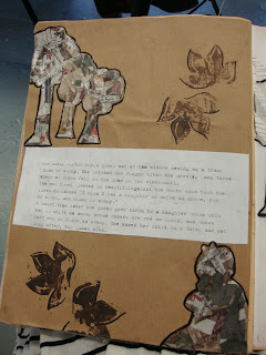
I then went to work onto the other side of the cut out page. I created some more typography and the cut out leafs fit the shape of the typography nicely. I will go on to develop the cut out style in my book.
I then went on to create a tree with a cement style material (again along with the use of typography) in order to create some texture. 
I think it works well in contrast with all the other flat materials I have used as it creates some relief style imagery, however I think I could maybe try and improve the look of it maybe by scratching in some bark style texture.
I also tried to create some cut out leafs coming off the branches, however they get completely lost within the page as they just blend in with the texture of the tree trunk.

Wednesday, 16 March 2011

Wednesday 16th March


After creating some additional typography I then decided to use cutting out of shapes to create more leaf motifs on the edge of the page. I also experimented with using reverse cut out to decorate a page. I then combined the linos I have previously done with the cut out leafs in order to develop both styles. I thought it worked quite nicely in contrast together and thought I could take this even further on another page by cutting the leaf shapes out of the page to give a cut out effect. I then added more lino and introduced some more typography and some illustration from the birds in Snow White. I think it worked well as the typography featured a line saying 'Even the birds in the trees and the animals of the woods..' so beginning to introduce some of the characters round the typography worked quite nicely. I think I will go on to develop this concept a bit further as it may be a nice way of bringing all the characters in to my actual final book.

Tuesday, 15 March 2011

Tuesday 15th March

After editing my SOI form this morning I identified that I will be looking at some extra artists that I had not originally stated. The extra artists are:

  • Chisato Tamabayashi 
  • Hayley Potter
  • Paul Willoughby
I will be looking at Chisato to get inspiration for how I will create my book and what you can achieve by using 2D materials. ie. pop up style pages. I will still be looking at Su Blackwell alongside Chisato.

The other two artists are illustrators so I will be looking at them to give me inspiration for imagery in my book.

Monday, 14 March 2011

Monday 14th March


Today I started printing with my lino I created last week. I did three prints in my sketchbook. The first I printed with brown first, and then did a green print over the top to create a 3D style image. The second I did a mix of both brown and green but as a flat 2D print. When doing the last, I decided that I had previously enjoyed working on fabric to do my typography so I decided I would print onto the same calico fabric I had used before. I used the 3D printing technique with two colours. It didn't print as defined as I would have liked so I decided to use a black marker to outline some of the edges. I then went on to outline some of the leaves using gold embellishment thread, and added a few gold sequins to selected leaf ends. I think it worked quite well and gives it a real delicate feel.
I then did some more typographic text next to the leaf prints in my sketchbook which I think have worked really successfully. 


With the rest of my remaining time at college I watched the Disney Snow White DVD. I took notes of every scene and some lines that I thought may be significant from characters, or that I thought would be important in illustrating the story. This will also be useful when not only looking at the original story, but making sure my book is jam-packed with details and exciting illustrations.

Friday, 11 March 2011

Thursday 10th March

Today I completed my sewing on the typography. I then went on to create a lino which i will print and experiment with in my research book. The motif contains leaves which is a common imagery in fairy tale books. I have already started drawing leaves when creating some typography but I feel it isn't as strong as I wanted it to be so therefore I will be using the technique of printing. The lino took a while to create as I want just to leaves to print onto the page, rather than a negative image of them, which meant I had to carve the whole background out to leave the leaves raised. This took a while as it was so time consuming so I will begin printing in the next few days.

Tuesday, 8 March 2011

Tuesday 8th March

Today I took a photo of what I think to be one of the best typography pieces I have done so far, using Photoshop i turned it into just a black and white image so the type was just an outline. I then printed my typography onto a plain piece of calico fabric and began to sew into it. I used gold thread and beads to make the first letter stand out, as is traditional with old fairytales. I then used green and red plain thread to define the outline of the rest of the type. I used a thicker thread to outline the main font and then a thinner line to create a shadow to add depth and make the font stand out.
I did not complete this today, and it took me about five hours in total. However, I will complete this as I think it creates a strong type and image. I aim to do this for the first page in my book so it will make an instant impact on the reader. All in all I think the outcome is worth the time it consumes. I aim to use more fabrics and types of embellishment to develop it further for my real outcome.

Monday, 7 March 2011

Monday 7th March

-I discussed artists and other areas I could go on to look at with three peers in my class. We identified that as well as looking at artists that illustrated or created type layouts for books, it would be useful to look at actual book artists in terms of the construction and presentation process. My tutor suggested visiting a large book store in London would allow us to see a variety of themed books and let us compare them like for like, this would work better as it would be near enough impossible to do this by just looking at them online.
-Someone suggested I look at the 'Little White Lies' magazine that can be viewed online as the latest edition had a clever use of typography. The image above is a screen shot of the type and layout that I thought would be most effective in my own project. The overlaying of type creates a really strong image which I think could work quite well in the more sinister aspects of the story.

-I also began to play around with basic typography, however I aim to become more experimental in terms of materials and layouts. I also want to attempt to bring the style of the image above into my work


Saturday, 5 March 2011

Saturday 5th March

Today I began preparing the pages of my sketchbook. I chose to use an old nursery rhyme book as although it is not a fairytale or the Snow White story, I felt it related well to my topic with the use of children's book illustrations. I think it works well preparing the surfaces of an already used book as you get parts of the images coming through which work well when you start creating other imagery over the top. I tried to apply less paint to the areas where there were trees, flowers and other elements from nature as i know these relate to Snow White, especially in the scenes set in the woods.

Thursday, 3 March 2011

Thursday 3rd March

-Using the internet I began to look up to see if there were any exhibitions I can go and visit which would either relate to the fairytale/Snow White theme or demonstrate techniques and processes which would relate well to this theme that I could then go on to experiment with.
I have decided I am going to visit a number of places to see the following things:
  • Paula Rego- In the Saatchi gallery there is a Snow White painting which brings up some themes that the Disney tale does not tell, for example, the painting shows Snow White is tugging on her dress, it has been known that people believe this is to suggest a possible sexual assult.
  • I found the work of Yulia Broskaya online, although I am not able to visit her work I will do some more research online.
  • I will visit the St Bride library in order to view the typography and calligraphy section in order to get inspiration for type faces and the way type can be placed on a page to become an art form in itself.
  • I will visit the V&A museum as it is currently holding the work of children's book illustrator, Walter Crane. Although I am not using the same style of illustration I think it will be helpful to see another take on story book illustrations.
  • I will also try and visit Kensington Palace as they hold the 'Enchanted Palace' exhibition. I have previously visited this exhibition before and think it will be useful in this theme of work as they have created a dark but beautiful atmosphere in each of the rooms. I want to try and transfer this into my final major project with the use of 2D materials rather than installation pieces.
-I also emailed an artist, Su Blackwell, who creates paper sculptures using books which also become part of the art piece. I emailed to ask if she had any exhibitions in or around the London area coming up in the new future, unfortunately she replied to say she did not. However, I am to use her to influence my work by looking at an online portfolio of hers.

Wednesday, 2 March 2011

Snow White

I created this when I selected the theme of Snow White just to begin to experiment with materials. I like the contrast of using black pen to draw Snow White and then using stitching to create the little bird.

Tuesday, 1 March 2011

Tuesday 1st March

I completed my Statement of Intent form, this allowed me to create my own brief and write down exactly what i need to do and when i need to do it by. I think this will help me as I know exactly what I need to research and how long I have to do it. Deciding on what materials I will be using before hand will allow me to research artists that use them in a new or more experimental way than I have done in the past and will allow me to think how I can use this in my development work.